Like many webmasters, I sometimes obsess a bit too much on how my webpage will show up in the search engines. To turn Google searches into visitors, I tweak and fine-tune my <title> and <meta name="description"> tags so that they’ll stand out in the search result pages.
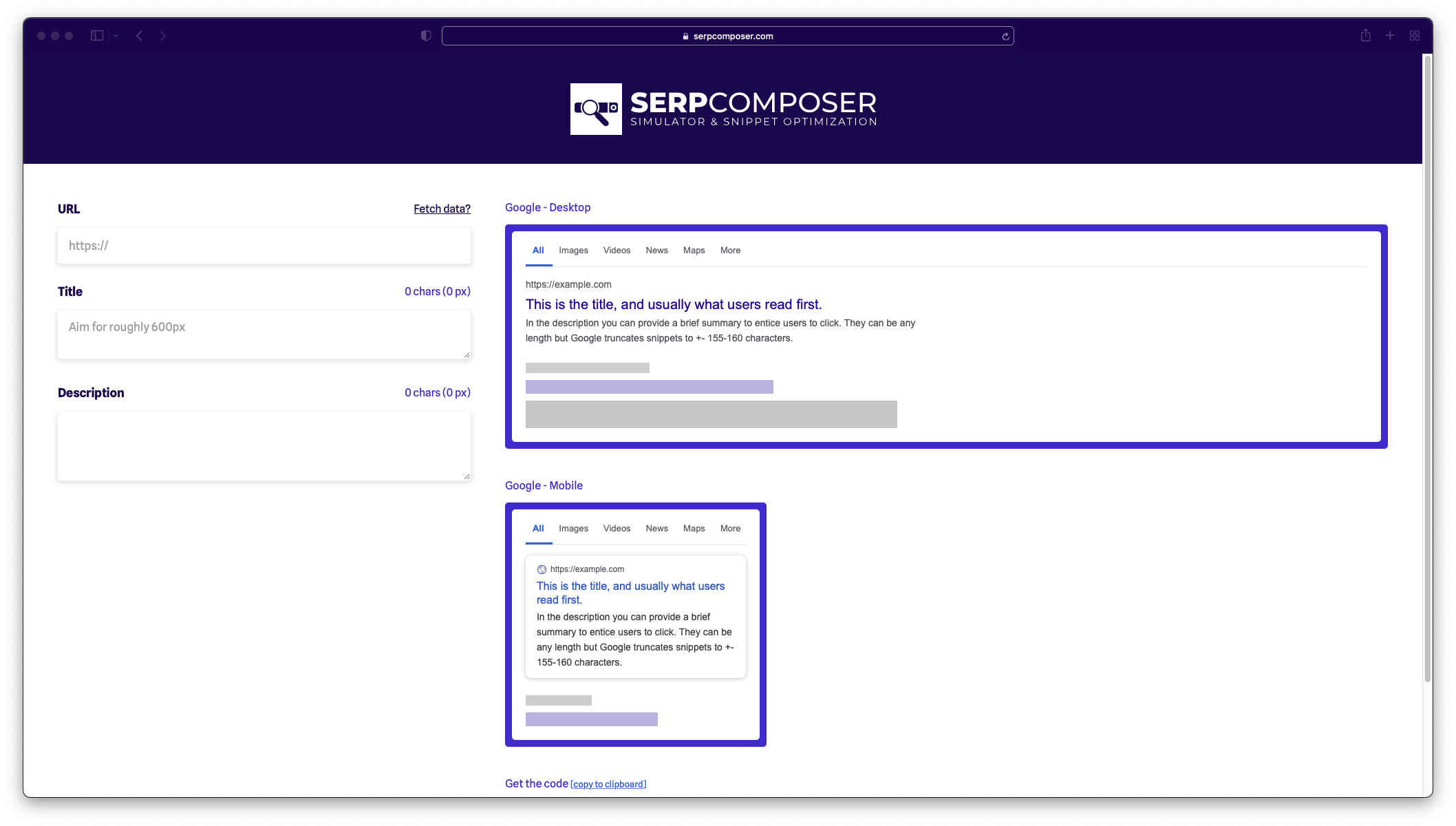
To do this I use a Google SERP Preview tool. There are many great options out there, from SEOmofo’s iconic tinkling lad to the polished tool from Mangools. But they were never 100% to my liking. I wanted to be able to see both a mobile and desktop preview, something clean and not too opinionated. After severely underestimating how much work it would be, I decided to build one to my own liking. Some 65 commits later —dozens of JavaScript and responsive CSS woes— I can introduce to you: SERPcomposer.com
- Dual view for mobile & desktop SERPs
- Optimized for all screen sizes. The form stays sticky in view on laptops and the previews elegantly shrinks down for smaller screens
- A “Fetch Data” link that pings the site in question to autofill the title/meta
- Autofill the fields with GET parameters
?url=,&title=,&description=- Drag this link to your bookmarks to auto open the current page in SERPcomposer.com
- No tracking or advertising scripts
Thanks to Kreativlab for the logo and Kimberly Nijzink for the brand identity.


This blog doesn't have a comment section. That doesn't mean I don't want your feedback but I'd rather have a more personal conversation via Email or Twitter.